When you’re shopping on a well-known retailer like MooseJaw.com (one of my favorites!), you probably don’t stop to consider the sheer number of variables that the retailer can be optimizing for. For example:
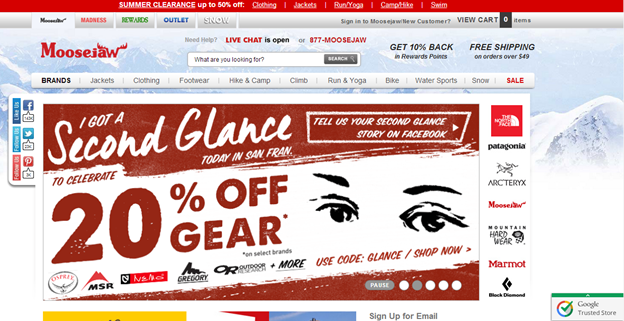
With a simple site like this:
- Which promotional offer do you decide to place at the center? How do you determine the trade offers between promotional offer placement and product placement on the homepage?
- Should Free Shipping be placed more prominently? Is $49 the right price point?
- How should the site respond to different search queries? Can we customize the landing page experience for each user?
And that only begins to scratch the surface!
With everything so measurable, every e-commerce store needs conversion rate optimization, constantly testing all variables for maximal conversion.
Here are 4 things that you can test your ecommerce store for in order to drive more revenue, with examples showing the potential revenue lift of each. Each test below shows a lift of 15% or more, so we’ll estimate that combining all variables would result in a 50%+ increase in conversion.
1. Free Shipping & Next-Day Shipping
I cannot emphasize enough how important shipping is to e-commerce retailers. Determining when your customers want your product – and how much they are willing to pay for shipping – is one of the most important variables for you to test.
Here’s an example from SmileyCookie, courtesy of the Visual Website Optimizer blog:
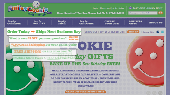
Adding next business day shipping increased conversions by 41%! (Their customers wanted their cookies, and they wanted them now!!)
Please pause and reflect on this for a moment – consider the amount of work that the SEO team is doing trying to increase organic traffic, what the PPC team is doing to reduce CPAs, what the affiliate team is doing to recruit additional affiliates into the program. Meanwhile, the optimization team makes one small change to the headline of the site and destroys the efforts of all the other teams combined in likely less than a few weeks.
Next-Day Shipping is only one example of more detailed tests:
- What price point is optimal for free shipping?
- At what point do you make the offer for free shipping? Do you blast it all over the homepage or do you only place it on specific product pages?
- Do you offer both free and next-day shipping? What’s the trade-off here?
At UpliftROI.com, we find that clients who have not tested shipping before will generally improve conversions by 20 – 30% by running simple tests. So if you’re not testing shipping now – make sure that you add this to your testing schedule.
2. Banners & Product Pages
Many retailers think that adding banners to their homepage will improve conversions (or at least, improve conversions of a specific product). But, this isn’t always the case.
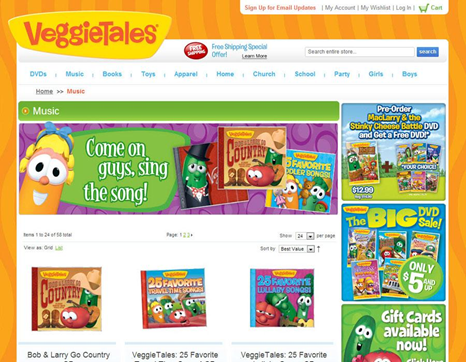
VeggieTales, an online retailer of really adorable children games, tested the impact of removing the banner from their homepage and simply focusing on the products.
Here’s the original page:
Here’s the test:

Removing the banners improved conversion by 17%. More often than naught, letting customers simply find the products that they are looking for is the most effective way of boosting conversion. (Personalization here is key, but more on that later).
VeggieTales also ran another test where they looked to improve the design of their product pages. Here’s the original page:
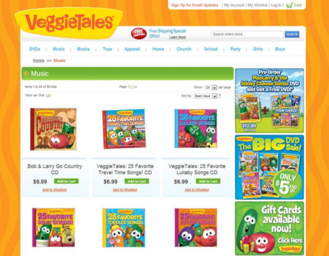
Their hypothesis was that the page felt too “cramped”, and wanted to improve the spacing / layout of the design. Here’s the final page:
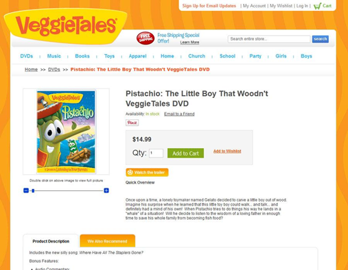
This test lifted revenue by 14%!
The two tests combined – removing the banner page and testing the design of the product page – increased sales by 38%.
Again, this is a clear case of the amount of value that you can derive from the time investment you put into conversion rate optimisation. It often doesn’t take more than a few quick tests to boost sales significantly.
3. Product Images & Size
When visitors come to your homepage, what should you present them with? Should you focus on a single product, a group of products, increase the image size of a select # of products, etc?
Determining what specific products you should present visitors with is an entirely other challenge, but one of the first, and easiests tests to run is, are your product images.
Here’s another example of a test that SmartWool ran, looking at the effect that product size had on conversion:
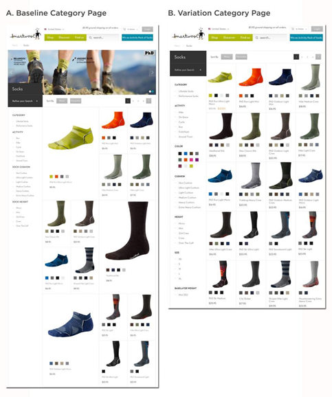
While improving the image size of specific products increased the # of clicks on that product, it reduced the # of purchases. Treating all products equally improved the revenue and conversion of the site by 17%.
Like the two tests above, the revenue impact of this one simple test can’t be understated.
4. Call to Action & Check-out Funnel
Finally, one of the most often overlooked variable to test on an e-commerce site is also the simplest: your checkout experience.
Your customer has added a product to checkout. They’ve clearly shown intent. Now what do you say to them to seal the deal?
Here’s one of my favorite tests from Insound, a fantastic retailer focusing on vinyl records, turntables, and basically anything cool.
Insound first lifted conversion by about 30% simply by reducing their checkout page to a single-page (rather than going through multiple steps):
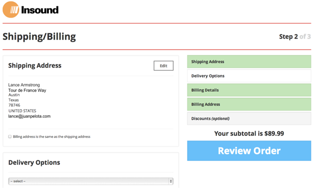
But, the company did not stop there. They wanted to extensively test what the best CTA was to get the customer over the line. Here are the four CTAs tested:
- Almost Done
- Submit
- Continue
- Review Order
Here are the results:
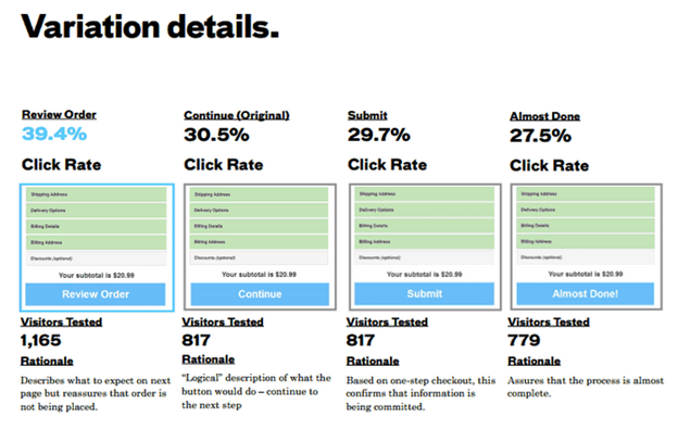
Look at the impact “review order” had on conversions! Comparing to the original “Continue” call to action, “review order” had a roughly (0.39/0.30) = 30% lift in sales!
That’s from one word!
And you can imagine the impact that copy has on other parts of your site:
- Do you ask customers to shop now? Or buy now?
- How do you describe your products?
etc. etc. Like everything else, small changes can have a drastic impact on conversion rate.
Summary
Every e-commerce site needs conversion rate optimization. These four tests don’t even begin to scratch the surface of e-commerce optimization – most of these are basic! Once these are out of the way, you get into the really interesting stuff, like e-commerce personalization, dynamic price optimization, shopping cart abandonment, etc.
What have you tested on your site?
