Let’s face it, not everyone is a professional designer. Or even has one on staff.
But that doesn’t mean they shouldn’t be able to use some of the newest design trends.
Some of the new ones are even a little too advanced for me to use.
So I decided to highlight three simple graphic design trends that almost anyone can use.
Let’s get into it.
1. Muted Color Palettes
One of the easiest ways you can update your graphics in 2020 is by using some trendy colors.
In the past few years, bold, vivid and bright colors were extremely popular with brands ranging from Adidas to Spotify.
But this year, more reserved and muted colors are going to be all the rage. A ton of brands like Apple, FastCompany, and more have already started using them in their marketing and on social media.
If you’re not familiar with muted colors, they are basically the opposite of vivid colors. In fact, one of the easiest ways to create a muted color is to desaturate it by adding black or white.
I like to think this simple infusion of neutral color takes the bright “edge” off the vivid colors and makes them feel a lot more natural.
A lot of people might think that the world is going to be a lot less colorful this year when they hear about muted colors. But that’s a common misconception. Just check out the example below from LinkedIn:
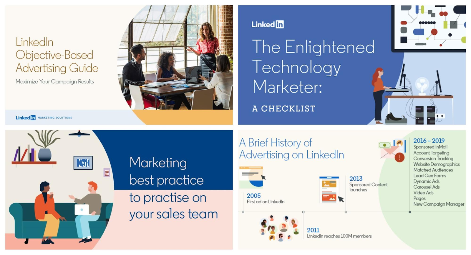
As you can see there will be a ton of color used this year, the colors might just be more reserved than people are used to.
When people are used to very loud colors, that shift is going to be hard to ignore! I think this will help your graphics really stand out on social media as well.
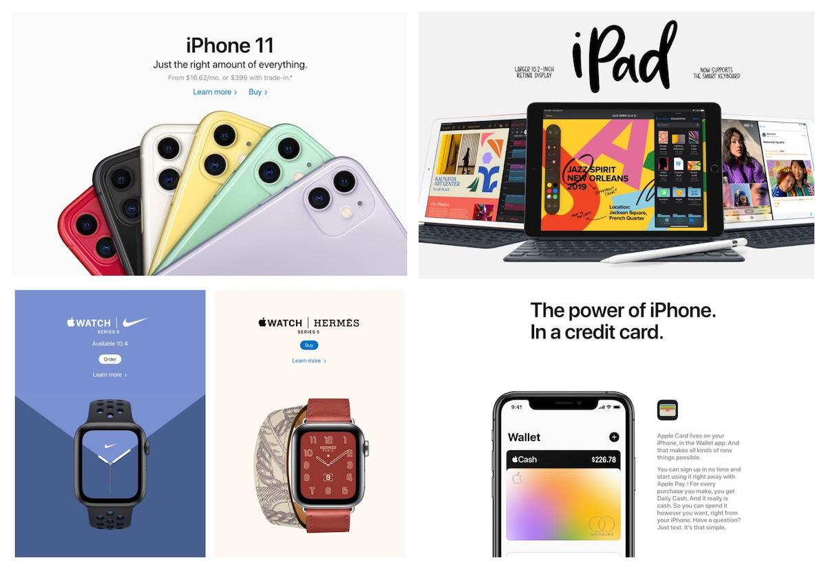
Now one of the best things about muted colors is that they don’t overwhelm the rest of the elements in a graphic. This means you can comfortably use a muted color as the background color:
This allows the text or illustrations to be the focal point. A loud or vivid color would have dominated the rest of the content, making it hard to read or consume on social media.
So if you want to update your graphics for 2020, I would recommend trying to use some a lot more muted colors.
I’m not saying that you should update or change your entire brand color palette, just start using them instead of vivid or bold colors.
2. Heavy & Bold Fonts
Next, let’s take a look at another design element that everyone should be familiar with: fonts.
I know everyone has their favorite font and uses it as much as possible, mine happens to be Oxygen.
But to really stand out on social media this year you might have to find another favorite font.
In fact, things are going to get a little bolder this year as brands start to use extra bold and heavy fonts.
There are a ton of different font weights, ranging from thin to regular to bold, with weights in between.
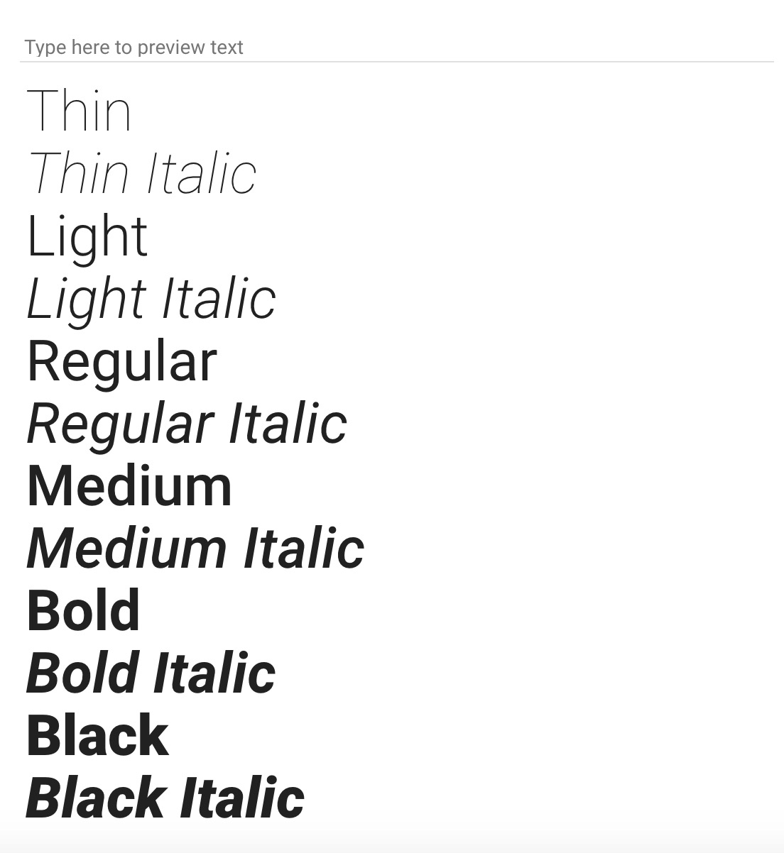
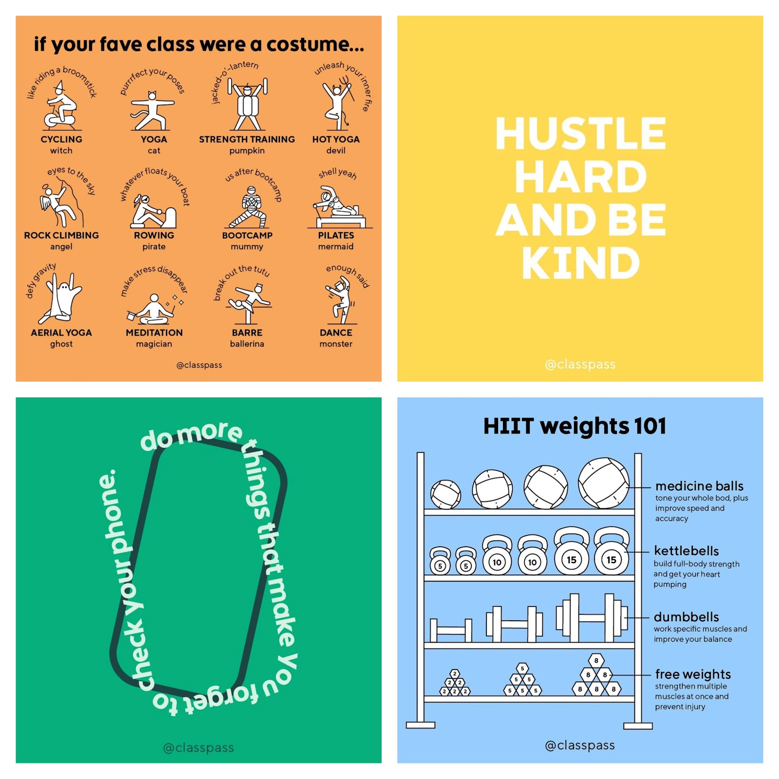
The heavy fonts are at the bottom of this list, and sometimes will be called extra bold. Here is a good example of these bold fonts in action:
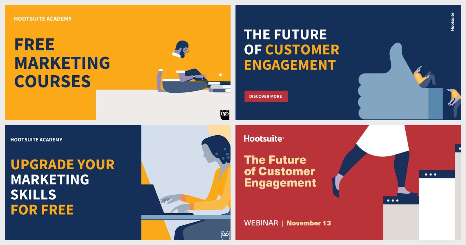
As you can see in this example, the heavy fonts make the text the main focal point of the graphic almost instantly.
If they would have used a thin or minimalist font I think the text would have been playing second fiddle to the illustration.
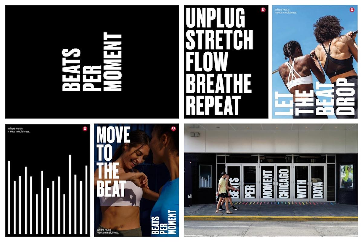
Obviously, these types of fonts will give your graphics an immediate feeling of strength or power as well:
These heavy fonts also can be combined with muted colors to create a ton of eye-catching contrast. In this example from Adobe, the muted backgrounds make the text really pop:

There is even a lot of contrast between the adorable dogs and the bold font. I think that the contrast is what truly makes this graphic instantly eye-catching and memorable.
The only thing you really need to remember about heavy fonts is that they should be used sparingly. Otherwise, it will instantly lose all of its power and make your graphics almost impossible to read.
In these examples from Acoustic, they really only use a heavy font for the titles:

The rest of the content uses a thin font that creates a ton of contrast with the thicker font. This variation will help direct the reader to important parts of your graphics as well.
So when it comes to heavy and bold fonts, less is more in 2020.
3. Genuine Stock Photos
I will admit that I used to hate using stock photos on social media. So much that I took the time to write a rather large article about how to avoid using them.
That article was written after seeing a certain stock photo used way too many times on social media. It’s still one of the most popular articles on Venngage, so I guess people are tired of using bad stock photos as well.
But recently I have come around and started using a certain type: genuine stock photos.
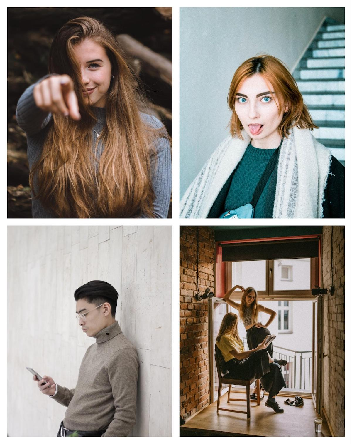
Not sure what I am talking about? Here are a few great examples:
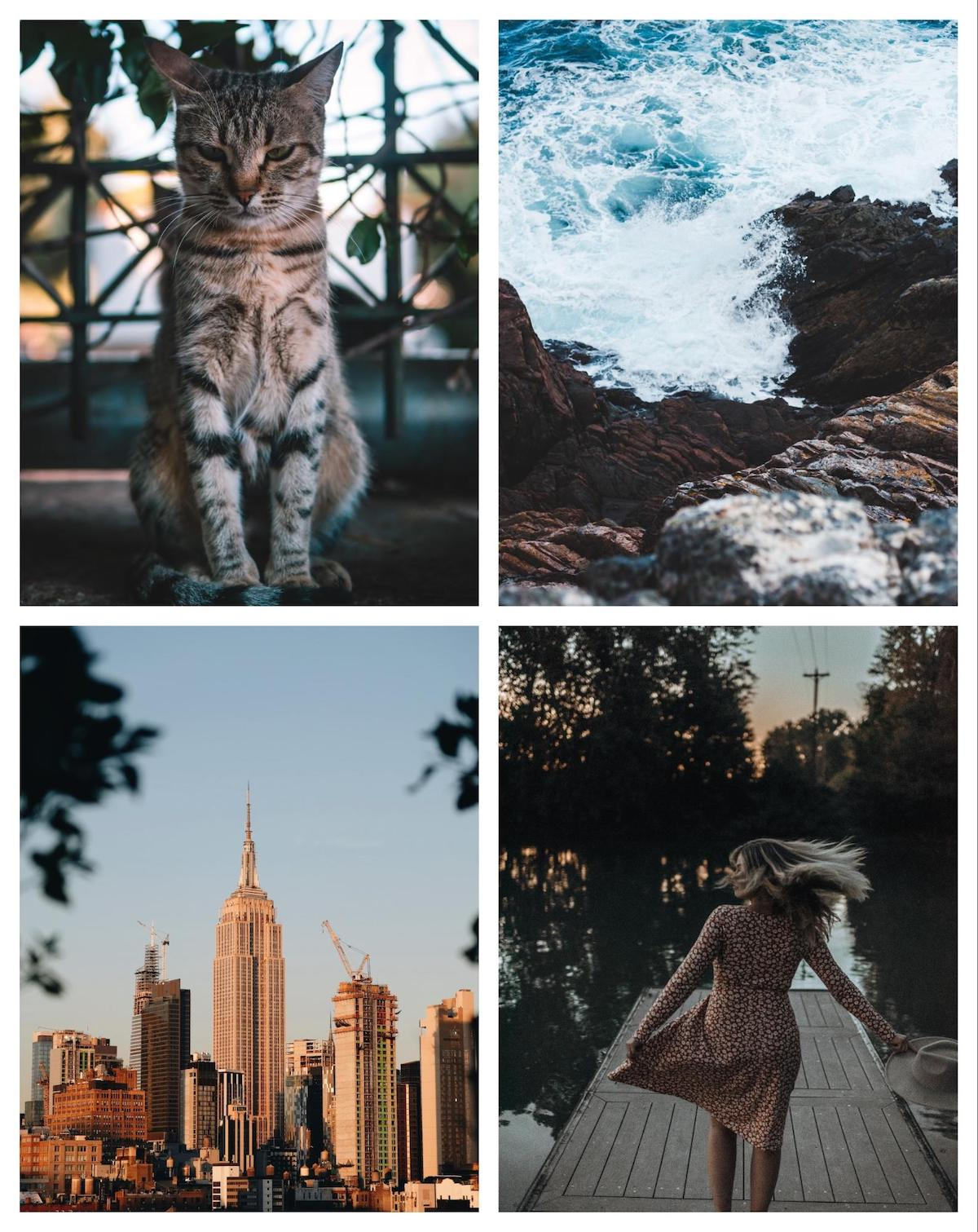
As you can see, these photos look like something you might find on your Instagram feed, not a professional stock photo site.
The muted color palettes, candid framing, and simple editing make these photos seem very authentic.
Almost like your friend took them while you guys were exploring a city one day. And that’s the point!
Now I know what you might be thinking that genuine stock photos might sound a little backward.
Especially because stock photos are supposed to be very generic and bland. Or they used to be.
Now almost anyone can create their own set of authentic stock photos in an afternoon.
Best of all there are a handful of great sites that you can find these genuine stock photos for free. My favorite stock photo site is Unsplash, which is where I found this example:
Plus, these genuine stock photos work exceptionally well with another trend, muted colors!
Now check this out if you want to check out some of the other graphic design trends for 2020.
- 3 Current Marketing Trends That Will Continue To Shape The 2020s - January 28, 2020
- 3 Graphic Design Trends Anyone Can Use in 2020 - December 3, 2019