 One of my favorite tools to use for customer support is a frequently asked questions page (also referred to as a FAQ). These pages have been in use since the dawn of the Internet, and the concept behind them is simple; visitors will often have questions, and the majority of the time those questions have been asked and answered before.
A savvy website will keep an updated page of frequently asked questions to cut back on redundant contact submissions, visitor complaints and to help educate visitors about your brand.
This type of information resource is an under used, but very effective investment for most businesses. Every business that requires customer help lines, support personnel or dedicated customer support representatives needs to offer a comprehensive online resource as an alternate for customers that will actively seek answers for themselves. Getting answers instantly by searching on your mobile phone is much more appealing than calling customer support and waiting for 20 minutes.
Many customers will try and solve product problems by searching online before they call customer support. I believe that if businesses invested more in these types of simple information resources regarding products, and encouraged customers to use them, customer support costs could be reduced drastically.
Most information dense websites will have a frequently asked questions page of some sort. Even though it’s a common tool and isn’t a new idea by any standards, very few businesses get the most out of their use. Here are some easily implemented tips to improve the function, form and usage of your frequently asked questions page or other information resource.
Organization is Key
The size of your information database will depend on the size of your audience, the quantity and variety of questions they ask, and the complexity of your topic. Some businesses may be able to answer 90 percent of customer inquiries with a list of 10 questions. Others may need a vast database of hundreds of answers just to handle half of the questions they’ve received more than a dozen times this year.
- Plan the structure of your resource so questions are divided into manageable groups.
- Never go more than three levels deep in a directory structure intended for the public.
- Use the simplest terms and descriptions possible for categories.
- Organize all directory structures in alphabetical order

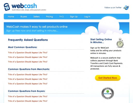
The designers that worked on Web Cash’s FAQ decided to dedicate the first section to the most common questions overall, and subsequent sections to the different individual needs organized by the role of the person asking.
Even if your FAQ or help index contains thousands of articles, I suggest creating a landing page that displays the 10 most researched questions. In most cases a small amount of information will address the majority of customer inquiries. Most users will stop using an information resource if they navigate past more than three screens without finding relevant information. Most users that do not find satisfactory information during their first experience will not return.
Make it Searchable
How do visitors phrase the questions? Consider the language that your average customer would use and format your articles to include those words. Use keywords, tags and descriptions to optimize for internal search.
If your resource is extremely large, like a law library or medical dictionary, you may want to consider integrating a semantic indexing framework such as XML, RDF, OWL, Unicode, Uniform Resource Identifiers, and other schemas to help with indexing.

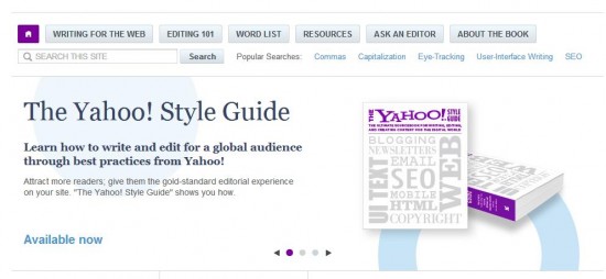
The Yahoo Style Guide is an information rich resource about which standards are best for writers working for online publications. Yahoo! figured out that writers would use the search function in most cases, so they developed the portal to emphasize search, which usually works in one try if you’re looking for relevant information.
By including several visible search boxes you address the need for immediate gratification that the Internet implies. Users will be more likely to use your resource again if they find relevant information during their initial use. Most people are familiar with Google and other popular search engines, and a similar feature in your FAQ will be instantly recognized by most visitors as a valuable tool.
Navigation and Design
Research shows that users of help sections and extensive FAQs trust the sources more if the layout and design of the user interface is usable and comfortable. The design and layout needs to be responsive and intuitive, as well as simple to navigate.

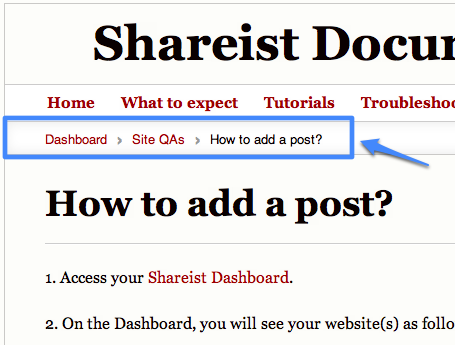
The Sharist uses breadcrumb navigation to keep users from feeling lost or having to start their search from the beginning when deep in their Q and A section.
These components can increase a user’s experience:
- Return function: A scrolling button that lets a user return to the top of a document at any time.
- Breadcrumb Navigation: Users often feel lost when they find themselves several layers deep in an information resource. Breadcrumb navigation is the best way to track your location and depth in the document.
- Readily available search boxes: Users may start browsing through an index, and decide to search after a few clicks.
- Links to Relevant Resources: Pixelmator does a great job of linking the relevant page to help customers satisfy their needs.
- Clear Use of Styles for Questions and Answers: Restating the question is why FAQs are more useful than a regular article or tutorial. Use separate styles for the questions and answers for ease of use and clarity.
Adoption Is the Hard Part
Creating a comprehensive and useful information resource is easy when the subject is something you work with every day. Who better to explain an oil change than the crew at Penzoil? The real challenge begins when you work at increasing the use of your resource by customers. The FAQ needs to be a customer’s first stop on their search for answers.
Google and Facebook have both taken a backwards, but effective, approach at curtailing the need for a customer support call center. They don’t give out their phone number… or any e-mail address, or contact information at all for that matter. When you search for a way to contact them you’re routed around their FAQ several times, and only after stating that your question wasn’t answered do you get access to a contact form. When you use it, you’re often to the point where the answer to your question is “we do not offer support on this level, or your request is against our policy. Here is a link to the FAQ page that says so”.
This works for them because their product is ubiquitous and dealing with their non-existant customer support is the cost of doing business. Many times I’ve searched through dozens of support pages only to reach a dead end with no recourse. This isn’t the supportive and open image that you want for your business.
No One Should Ever Criticize Your Support
You need to leave other options open. The best thing you can do to increase adoption rates is to focus on usability, simplicity, and relevance. This begins with organization, relies on searchability and ease of use, and is optimized through navigation and design.
I suggest keeping statistics about what customers are asking and designing your FAQ to represent real-time needs. Make the first page display the 10 most asked questions at the top, and then include categories below that. Set up a system that tracks all customer inquiries, and if possible update your FAQ every time you answer a question. Your goal here is to never answer the same question twice.
Route all inquiries through online contact forms, but continue to be very proactive in responding, and offer an alternate support contacts for customers that are completely against digital communication. When a customer disregards the FAQ and sends in a question that you’ve already answered, direct them to the relevant page on your FAQ. If their question hasn’t been addressed, write up a complete and effective response, and add another entry into your FAQ. You can make gains easier by re-training repeat callers than by advertising your intentions to a customer base that isn’t asking questions at the moment.
If your FAQ works as well as SIRI and customers can get help instantly through their mobile devices, why would they want to call customer service? Return on Investment doesn’t have to be an increase in sales and profits; it can also be a large decrease in cost, or gains in customer satisfaction and overall product value. No question about it, your business needs a FAQ, and possibly a more robust type of information resource. The only questions left are in the details.
- Blogging Isn’t a Rocket, It’s More Like a Roller Coaster - August 19, 2025
- Value vs. Expectations: The Fight for Startup Survival - July 31, 2025
- The Evolution of Marketing: From Catalogs to Cat Blogs - November 8, 2022
- How to Make a Tweet This Link - February 5, 2022
- Dramatically Improve Marketing Results with Advanced Analytics - September 20, 2021
- The Next Chapter for Social Media Sun - June 4, 2013
- Optimizing Your FAQ to Maximize ROI - December 5, 2012
- Weapons of Influence and Klout’s Role in Marketing - November 17, 2012
