When you have moved beyond the concept stage of your app, it is time to move into the branding stage. One of the most important (and frequently bungled) steps, you have to use the memorable brand name, iconography, and even typography to make your mobile app immediately recognizable. This will also help with future apps, which will be associated with that brand.
Color has a huge impact on the success of your branding efforts. Having the right one(s) could be the single difference between a mobile app people remember, and one they skip over in the iTunes store.
The Importance Of Establishing Emotional Tone In Branding

Eliciting an emotional response is even more crucial than sparking recognition. You want customers (and potential customers) to connect with you on a deeper level. You want them to associate your brand with the exact feelings you have chosen to convey.
Imagery, such as logos, don’t have this kind of oomph. Which is why you should use your vectors for association, your colors for emotions.
The Psychology Behind Colors In Design

Certain colors have long since been linked to feelings in those who see them. This is all related to the psychology of human beings, and how we make links between Point A and Point B. Researchers have been finding these connections for decades, and they are used by the biggest brands across different generations even as other elements change.
A sample of colors and their affiliated emotions include:
- Blue – Calm and relaxed, trusted.
- Yellow – Energetic and positive, optimistic.
- Red – Intense and important, focused.
- Green – Profitable and natural, earthy.
- White – Pure and simple, clean.
- Pink – Romantic and loving, feminine.
- Orange – Bright and cheerful, childish.
- Black – Blunt and powerful, minimalist. –
- Purple – Luxurious and regal, trendy.
When combining any of these colors, you are able to create a more intense emotional connection. So a blue and white branding will be clean and relaxed. An orange and yellow will be cheerful and positive. A pink and black will be feminine and powerful.
Mobile apps have limited space to make an impression, unlike some other mediums (i.e. websites, branded lit, ect). So making the most of your branding space by relying on color and emotional tones will have a big impact in the space you have to make it.
Examples Of Mobile Designs Doing It Right
The best way to get a feel for how color is being used in mobile app design is to take a look at what others have done. As there are so many great designs out there that manage to association tone and product so well, picking a few to point to is difficult.
In no particular order, here is a small sampling of incredible mobile apps that take color psychology and run with it, to great affect.
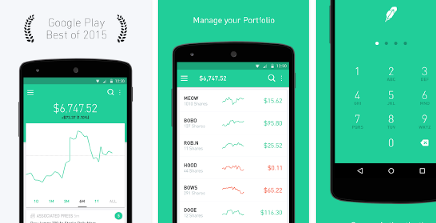
Why are these two together when they both have entirely different functions and are owned by different companies? Because they have something very important in common: each deal with money. They monitor different types of financial accounts, and hold extremely sensitive information within their servers. That also includes the separate app, Mint Bills, which allows people to completely run their accounts and pay off pending invoices for most of the expenses in their lives.
Financial related mobile apps have always had a unique challenge. They have to be functional, private, and trustworthy to the extreme. There is no room for missteps, even when it comes to the usability of features. Small problems are proof to consumers that your app can’t be relied on, and they might associate that with their information being unsafe.
Design as a consequence is very carefully considered, and that includes colors and how they impact the way users look at the brand. Notice that both have opted to use a combination of intermediary colors between blue and green.
This is a clever move. It gives an impression of both wealth and trustworthiness. It makes the user feel calm, and taken care of. This is an important part of why both have been so successful.
Feeldreams
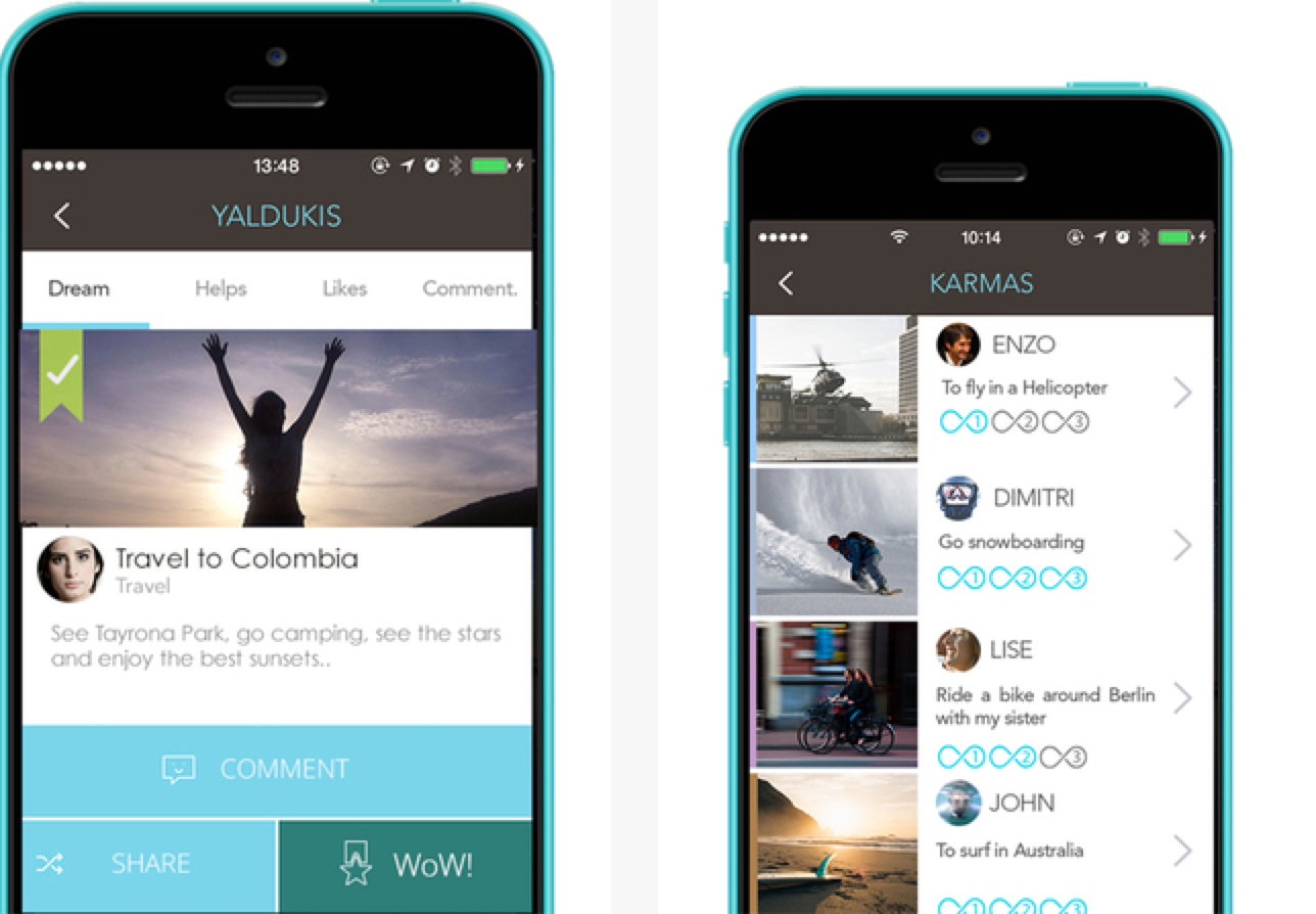
Feeldreams is an interesting looking app, because color isn’t necessarily the point. It uses a backscreen of shining stars on a night sky, though it does have a logo. That logo is an infinity sign that has been painted in a grey/blue color. It is meant to use the blue for relaxation, but the grey tone gives it a more muted feeling that is closer to the namesake of dreams. It is hard to see it and not make an association with sleep, even without knowing the app name.
That same color scheme is used through the app once you have logged in, with clean white for the background. Other buttons use gentle tones of otherwise bright colors, like subtle pinks or oranges or dark blues. It works with the main color scheme without overpowering the emotional message of the design.
Had they gone with even a shade brighter in any of the colors, it could have thrown the entire thing off.
SnelTrein
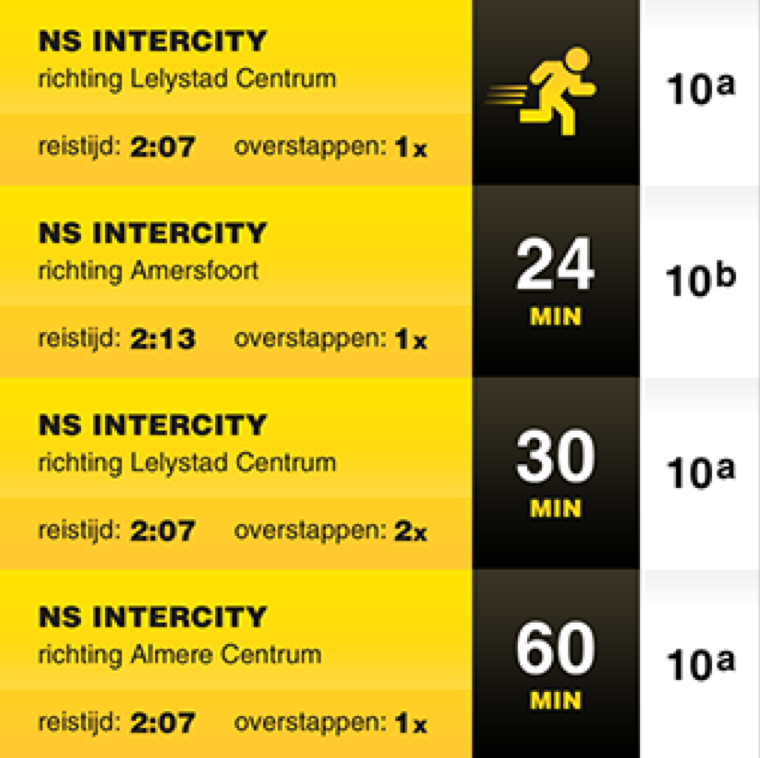
Transportation app SnelTrein is all about movement and forward motion. It is about catching trains any time, and always knowing when the next one will be so you never have to miss it again. Even if the schedule has been screwed up (a common issue anyone can relate to).
So it is no surprise that they have chosen a very energetic color that is a mix between yellow and orange. It is crackling with energy, but with less aggressiveness than a red color might have suggested. Seeing the yellow-orange makes it feel like, yes, this is an energy filled app. But it isn’t dire or dangerous. You will be moving, not rushing. Catching the train without hassle, not jumping on in the nick of time with plenty of stress along the way.
They manage to strike a great balance.
Meernotes
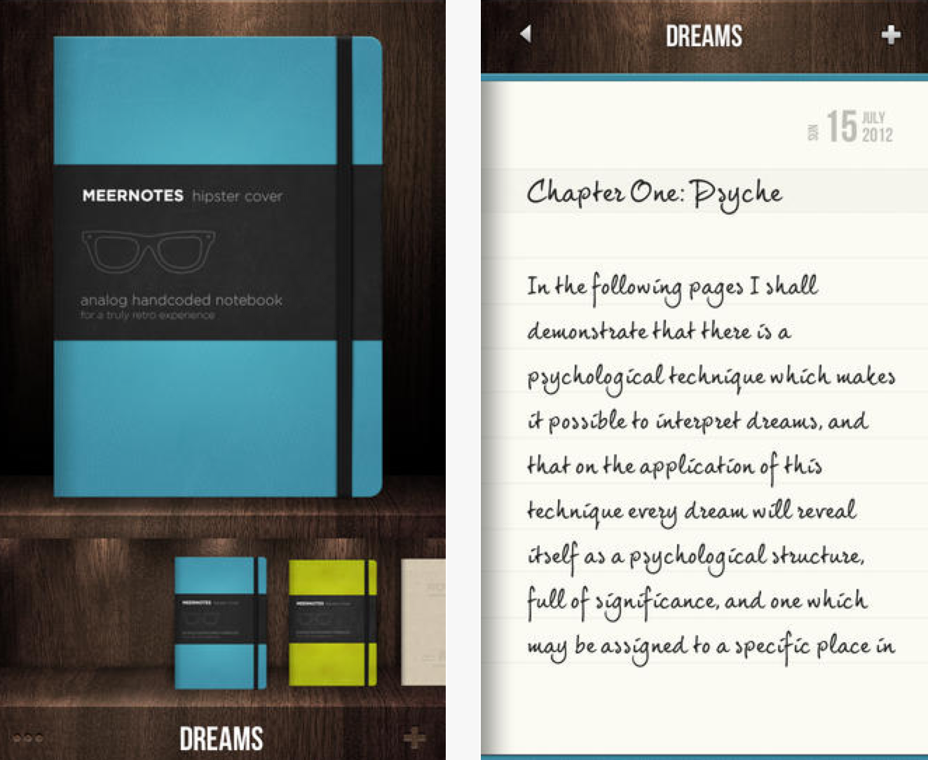
Have you ever noticed how many to-do list or notebook applications use a red logo? Meernotes is no different, and it is understandable. Red is a color that catches attention and speaks of urgency. It makes you take notice. You are reminded that you have things to do, places to be, things to say Red is the color of importance, one that you can’t ignore.
But that motif isn’t carried into the mobile app itself. They use a wood background with light blue tones. Which is brilliant, because the red catches your attention and makes you open the app. The app itself makes you feel like you may have a lot on your plate, or plenty of thoughts in your head, but you can remain calm. There is plenty of time to do it, and you have more than enough focus to see it through.
The colors for Meernotes are the perfect mix of urgent and reassuring.
Evernote
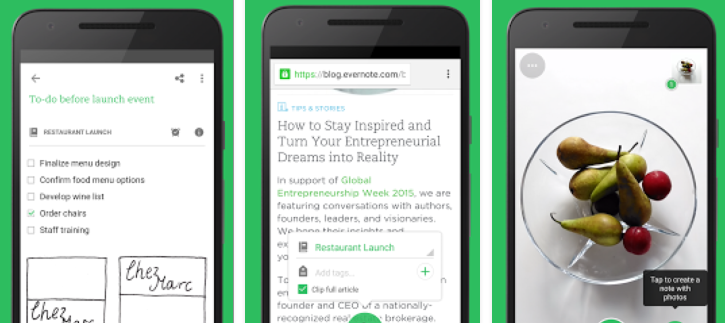
Evernote is an interesting case. The actual color scheme doesn’t follow the traditional psychology, in that it doesn’t connect right to the subject matter. It is a note application that lets users collect things from around the web, write memos, send tasks to other users, tag and bookmark webpages, and do a dozen of other productivity boosting activities. All while remaining organized and on top of their game.
So, why did they choose green? Looking at what green usually sparks, it almost always comes down to wealth or nature. Neither of which are directly linked to the purpose of this particular mobile app. Sure, it could be argued that being productive and organized is a step to being profitable. But that is a weak connection, at best. As for nature, the logo is an elephant, yet that is a play on the “elephants never forget” adage. Not a way of eliciting thoughts of their habitat.
Whatever the case, it has worked well for them. You can’t think of Evernote without thinking of that bright green logo with the cartoon elephant head. It shows that even the positive feeling sparked by a color can be enough without bothering to follow the meaning behind it.
WoooBee

This concept design for an app shows that you can use both moderns and traditional combinations to come up with a great final result. The chrome tones of the background are just short of metallic, and give it a trendy appearance. By alternating between lighter and darker chrome greys it improves the depth and makes the background more dynamic.
With the attractive blue, it gives a splash of color that keeps the chrome from overwhelming the design. It makes the whole thing look gentler and more friendly, less cold and futuristic. The front page logo with the chromatic orange also captures a mix of the two, bringing it all together nicely.
Conclusion
Mobile apps rely on all elements of the design process to make them successful. When branding, the same principle has to be kept in mind. Something as simple as a shade of blue can make a big difference in the perception of your brand. Emotional connections are important.
Have an example of a mobile app that used excellent technique in choosing their color scheme? Let us know in the comments!
- Color Branding: How Colors Affect Mobile App Design - March 27, 2024
