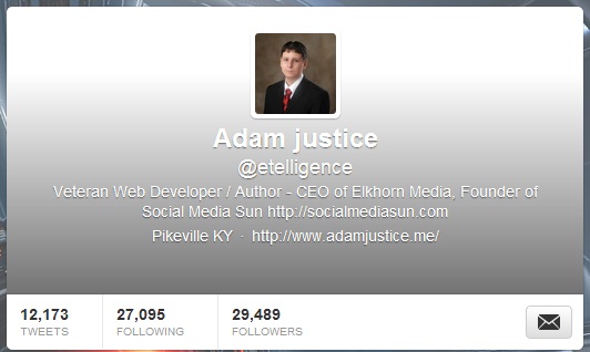
 Last Week Twitter introduced an updated profile design based on a prominent header image. The change was designed to enhance the enhanced profile pages that Twitter launched for advertisers, which also allowed businesses to pin tweets. The new design overlays your avatar, bio, link, name and location over the header, which is roughly displayed as 520×260.
It’s really a toss up over whether the enhanced profile with a header or the traditional profile is more aesthetically appealing. Since there is a lot of text and your avatar displayed over the image, it is very easy for beginners to make their Twitter profile look worse. At the moment the new header is optional, and your profile will keep its traditional layout unless you upload a header image. Here are some things you need to know in regards to this latest Twitter change, which is drastic in terms of Twitter upgrades.
Keep Your Background in Mind
Before you open up Photoshop (or Paint, which appears to be popular among Twitter users wanting to try out the new header feature) upload a basic image and give your overall design some thought. If you’ve invested heavily in a background image, or especially like your current design, adding the header may not be the best move. You’ll want to make sure that your overall design expresses some form of brand continuity, and integrating a header may require a new background to keep your design from feeling redundant, crowded, cheap or unusual.
The Header Can’t Be Smoothly Designed Into Twitter
It is the equivalent of what an average person would add behind their title text on WordPress. My first thoughts was to include a black/white gradient that faded into my tweet stream below, making it look like the header blended right in to the functional areas of my page. It turns out that Twitter already overlays a gradient that is the exact opposite of what I wanted to make sure your bio text is visible and that there is a clear separation between where your header ends and where Twitter starts. It makes solid colors look like they get darker towards the bottom, and it made my white look gray.

Twitter’s overlying gradient is meant to help the white text stay visible regardless of your background image. This bare enhanced profile shows just how severe the gradient is.
You Have No Control Over the Text
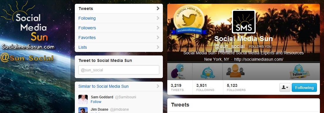
Your avatar, bio, name and location are displayed in white over your header image. Unless you want to delete everything, you cannot change text colors or alter the placement in any way. The gradient overlay makes it hard to have a conflicting background, but all design needs to pay particularly close attention to the area where the text and avatar will appear. The best design integrations will have the avatar placement pinned down perfectly, and use the relationship between the avatar and header to make their designs innovative. On the Social Media Sun Twitter design, I added icons over Tweets, Following, Followers, and the Follow Me button; again the gradient overlay lessens the effect by making that area dull.

Through trial and error I judged the approximate position of my follower count, tweet count and follow me button, and designed the SMS banner to accent those bordering features. There is a slight difference in IE and Chrome’s display of my header, so it doesn’t quite align in one or the other.
Header Dimensions
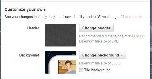
Even though the actual display measures approximately 520×260 on my display set to 1366×768, Twitter recommends using a graphic that is 1200×600 as optimum. After uploading Twitter gives you the option of scaling your header. I suggest using the recommended size because there is some deformation on odd sized images, and the fit will suffer. The maximum file size of a header is listed as 5mb, but I have had trouble uploading background images that were just slightly smaller than the recommended size in the past, and expect that you’ll need a smaller file size in this case as well.
You Can Always Remove It
Take some time and try out a few images that you have rights to. The header is more like a second background than it is a logo. If you cannot find a match that suits your needs and is an overall improvement on your page design, go back to your design settings page, click on change header, and select the remove option. Your profile will revert back to the traditional layout, and there is no harm done.

Changing your Twitter header is as simple as finding the button on your design settings page and uploading an image. Removing or replacing a header is just as easy.
Your Twitter Profile Isn’t that Important
This is ultimately an attempt from Twitter to make a play on larger mobile device screens, and to enhance their package for advertisers by adding more branding opportunities. The truth is, most Twitter users will never even see your page design. Almost all of the content on Twitter is consumed from the feed or connect tab. Out of those users that will take a look at your Twitter profile, computer users are more likely to take a look than users of mobile devices, and those views will almost always come immediately after following you. With mobile usage still rising, your profile page will become less and less relevant. Of course, bigger brands and celebrities will always have visitors to their profile page.
Don’t Compromise Overall Design Just for a Header
The details will make or break your profile design. Familiarize yourself with all the design elements that you do have control over, such as the link color, the transparent overlay, your avatar, background, and even the inclusion of bio text. If you’re Coca Cola, do you really need to tell everyone that you’re a soft drink? You will either need to consider the placement of that text, and weigh your needs to decide if it is worth removing. Link color is almost as important as the graphic elements on your page. Complimentary or monochrome colors are safe bets.
We still don’t know if Twitter will move all users over to the enhanced profile designs. Even though it isn’t mandatory, integrating a stunning header into your profile design is another reason for followers to visit your feed. Why not strike while the iron is hot? The simple fact is that with all the design variables dependent on each other, a header will work well in some designs, and will be harder to work into others.
Have you switched to an enhanced profile yet? Which layout do you like better? If you’ve installed a header, we’d love to hear about it in the comments.
- Blogging Isn’t a Rocket, It’s More Like a Roller Coaster - August 19, 2025
- Value vs. Expectations: The Fight for Startup Survival - July 31, 2025
- The Evolution of Marketing: From Catalogs to Cat Blogs - November 8, 2022
- How to Make a Tweet This Link - February 5, 2022
- Dramatically Improve Marketing Results with Advanced Analytics - September 20, 2021
- The Next Chapter for Social Media Sun - June 4, 2013
- Optimizing Your FAQ to Maximize ROI - December 5, 2012
- Weapons of Influence and Klout’s Role in Marketing - November 17, 2012

I’ve played with the NEW Twitter header on my main account http://twitter.com/roncallari but have remained with the old format for my other two. I find the new design aesthetically less appealing and if you don’t spend a lot of time refining the final look – it can become as Adam intimates here as becoming “new” header for “new header” sake. Jury is still out. Looks like Twitter was influenced by FB and their roll-out of the FB profile covers a couple months back. But with Facebook you have more real estate to work with. With Twitter, I feel like they’re forcing a round peg into a square hole.
I like the new header option. It took me a few trys to get the proportion correct. When my image was too big it defaulted to the shaded look described above – kinda basic. I uploaded an image I own + had on my computer. I wasn’t able to move it around at all – to center it or adjust it in anyway. It’s fine for now. When I am in the mood for another frustrating graphic design chore, I will try again. What do you think? @EncoreDecor:disqus
All I saw is the generic black matte texture that Twitter puts up by default. Are you sure it’s on there?
Totally agree that it’s easy to make this look messy – seen lots of people with heads chopped off by their avatar picture! I’ve gone with a chalk-board … it suits my business/brand & is nice & simple – too simple? http://www.twitter.com/TickItOff Fran :o)
Not bad Fran. I would personally try and use a border at the point where the feed and header meet; but then again, the gradient affects any attempt at making the bottom look right.
I have updated everything but I cant seem to upload any image for my background image, it always says:
“Size can’t be blank Your image was too big. Your file was not an image. Your file was not an image. Filename can’t be blank Content type can’t be blank”
even though it is below 800kb, what size in px should it be? same as header image?I just want to get rid of the grey shading.
When I try to take away my header, the black one just replaces it, & it won’t go, what should I do?
Try the ‘Transparent Header’ effect, with a couple drop shadow accessories , the effect is a lot of fun to play around with. 🙂