 The evolution on web design reminds me of the auto industry. When the first websites came online, technology limited the aesthetics to color schemes and white space. New programming languages and improvements in graphic design programs allowed designers to start using sleek curves, flashy tail fins, and match aesthetics to real world inspiration. For a time in the early 2000s the Internet reminded me of the iconic cars in the late 60s. They were beautiful to the point of being sexy, and so advanced that the whole realm of web design was on the cusp of changing directions.
As Web 2.0 sites launched the Internet took a step back in the aesthetics department. Designers scaled back on visual components and ramped up the amount of text to take advantage of search engines that couldn’t interpret images. Social networks such as Facebook embraced simple design to speed up load times and focus on the use of the application. In a way the web followed the same path that the auto industry took in the late 70s and 80s. Reaching a design pinnacle where the only way to add more curves would be to make it a circle, designers reverted back to sharp corners; hatchbacks, round headlights and several other design cues that in my opinion are just plain ugly.
Just as auto manufacturers came full circle in the last decade with retro design cues mixed with futuristic styling, web designers are once again pushing the limits of what a web browser can do. Maybe it’s the influx of news tools such as HTML 5, mobile devices and faster connections. Whatever the reason, designers have picked up on some fresh new trends lately, and if you’re a web professional, you need to introduce yourself to the next steps in the evolution of digital design.
Responsive Design
One of the problems I faced when returning to web design after a break in 2001 was an increase in the disparity of browser resolutions in use. I was accustomed to designing for 800×600 fixed width monitors, but I found that nearly half the users had moved to 1024×768 displays.

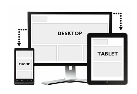
Responsive Website Design will alter the layout of your site to fit the specific device or resolution that a viewer is using. This allows for and consistent and functional design on tablets, laptops, mobile phones, or any other device you can think of.
I was forced to adapt by either creating webpages that would fit all resolutions by default, or using percentages when defining page width and testing the design on several resolutions.
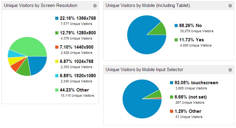
In October 11.73 percent of visitors to Social Media Sun were viewing the site from a mobile device. That number is expected to rise over the next year, and many technologists predict that tablet devices could be as prevalent as laptop computers in a few years.

The most popular screen resolution is 1366×768, but that only represents 22.16 of users. 12.79 percent of users viewed Social Media Sun on a 1280×800 screen, and the three other different resolutions accounted for approximately 7 percent of viewers each. 44.23 percent of users were not using one of the top five resolutions, so it’s impossible to know how many different resolutions were represented by SMS viewers.
With such a wide range of devices and resolutions, it’s important to account for every possible permutation when designing a website or application for the web. Visitors and profits can come from any device, and any resolution. Responsive designs alter their layouts and parameters depending on the device and resolution a visitor is using.
Instead of offering a bland, dumbed down version for mobile users, or requiring an obscene amount of panning and scrolling, designers now have the option of having the site respond to media queries by fitting the layout onto the specific screen viewing the content. You can layout as many grids as you want, theoretically creating a uniquely sized layout for every popular resolution, and every popular device. Responsive design isn’t just a trend; it’s the next generation of web design.
Nearly all new Premium WordPress themes are developed with responsiveness in mind. The WordPress Responsive Theme is a great free alternative that you can use as a parent theme.
Parallax Scrolling
With all the talk of social media and brand stories, designers have been coming up with some pretty interesting ways to tell those stories. Formerly, Flash based design would allow designers to integrate animation and movement to control a reader’s eye and accelerate a story. With the introduction of HTML 5, designers do not have to sacrifice SEO and compatibility with Apple devices to use the same features.
One of the latest trends using HTML 5 draws its inspiration from old video games (there’s that retro loop I mentioned!). Parallax scrolling is when 2D objects are placed on different layers and are scrolled in the same direction at different speeds (usually the closest layer moves the fastest). This gives the impression of three dimensional space, even though the graphics are only 2D.
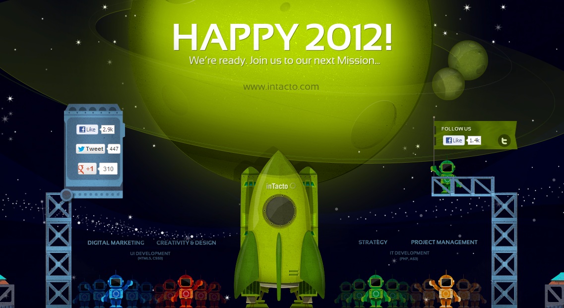
Web designers have turned your computer screen into a 2D scroller, complete with brand story. Two of my favorite examples of parallax scrolling designs are Heat Pump Dryers, and Intacto’s 10 year anniversary.
The Heat Pump Dryer tutorial is a simple page that uses scrolling like an input device, explaining the mechanism of a heat pump dryer as you scroll down. Intacto’s anniversary page is triggered by a start button, and you get to sit back and watch as a rocket ship takes you from 2001 all the way to the present.

Intacto’s timeline is a detailed Parallax design that celebrates their tenth year as a company. The viral publicity from the great design alone is worth a look.
We’ve only just scratched the surface of what designers can do with parallax scrolling. As web developers are approached with deeper brand narratives, you’ll only see these designs become more prevalent, detailed, and interactive. They’re often used as a spin-off supplement to mark a special occasion, product launch, or incorporated into generic web pages such as the ‘About Us’ page to make something that is usually mundane seem special.
Futuristic Styling
One of the things Steve Jobs asked for when re-tooling the applications for the iPod was that the styling should reflect real world objects. He asked the designers to capture the look of the leather bound calendar in his private jet when designing the calendar for the new iPhone.
This attention to detail was part of the reason that Apple products felt premium. However, we’re approaching an age when a large percentage of computer users will have never used a wall calendar to record birthdays. They have never played a cassette tape, and they wouldn’t recognize a Polaroid camera. These retro icons and ruled tablet paper backgrounds worked to bring us into the mobile age, but the next step is making those design elements reflect the futuristic devices they’re viewed on.

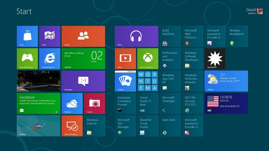
Microsoft has taken a more progressive approach with their new operating system, Windows 8.
Adopting a more progressive theme is something that Microsoft aimed for when developing Windows 8. The new OS has received a lot of negative press from Internet communities, but most users that actually give it a chance end up liking the software. I predict that Apple will also move toward a more futuristic aesthetic in the near future. Our hardware is now capable of processing beautiful graphic design, I think it’s about time we let the designers earn their salt.
Have you noticed an increase in other design elements recently? Are there any features or trends that you would like to see more of?
- Blogging Isn’t a Rocket, It’s More Like a Roller Coaster - August 19, 2025
- Value vs. Expectations: The Fight for Startup Survival - July 31, 2025
- The Evolution of Marketing: From Catalogs to Cat Blogs - November 8, 2022
- How to Make a Tweet This Link - February 5, 2022
- Dramatically Improve Marketing Results with Advanced Analytics - September 20, 2021
- The Next Chapter for Social Media Sun - June 4, 2013
- Optimizing Your FAQ to Maximize ROI - December 5, 2012
- Weapons of Influence and Klout’s Role in Marketing - November 17, 2012

@_inTacto’s design is just awesome!
@Adam, I guess you forgot to mention one contestant: vertical scrolling….perhaps the best feature and most useful for users.
Vertical scrolling? I’m not sure I understand, all websites scroll vertically. Do you mean something like this http://five3.me/features/ ?
Yeah. I mean this.
That is actually a parallax scrolling page. It’s not as blatant as one with rocket ships and such, but the speed at which the menus scroll is offset to the content. Most of the pages that operate like that (pressing a button initiates a vertical scroll) are Parallax. Even a small amount of parallax gives a more fluid and dynamic touch to a website that scrolls by itself.
Who would’ve thought that responsive design for a website can have complex attributes and yet play very important roles for website design. These things are always important to know especially when we create websites for small business owners, our clients. Thanks Adam for creating such informative post! 🙂
Adam:
I noticed a new trend of Pinterest board type websites. I guess like Windows 8 there is a shift to Boxes that you can click on to open up a blog or a product. Even Apple and Ebay are doing that.
I am looking for a new WordPress theme like that for one of my websites. Can you recommend any?
How about flat designs and typography?
I believe these were some of the peak trends too during 2013.