 Last week the powerful answer engine Wolfram Alpha, which is a big part of Siri’s software, added a new feature that allows users to get a detailed view of their Facebook profile. By going to Wolfram Alpha and inputting Facebook Report in the query box, then giving Wolfram Alpha access to your Facebook account and setting up an account on Wolfram Alpha, you can generate a report that covers a wealth of information about your Facebook profile.
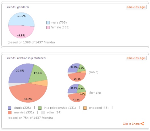
At first glance you’ll see that Wolfram calculates the ratio of male to female users, looks at what countries your network lives in, and displays a detailed presentation of your friends’ relationship status. Getting a little more useful, the software plots your most active posting times, engagement statistics, and your most active engagers. The data seems a bit trivial, but somewhat useful. At the very least, it’s very comprehensive from a statistical viewpoint; after all, not everyone is a marketer.

The majority of Wolfram’s Facebook Report will show a balanced distribution of different demographics for the average user.
The Network Graph
I’ll start off by giving you a little background information about myself. Early in Facebook’s existence, I was in the middle of college. I should have been one of the very first users, but Facebook didn’t think that the community college where I studied was important enough to access their network. I was connected with more friends on MySpace anyway, so I moved on. After Facebook opened their doors to everyone I put off signing up for an account as long as I possibly could.
I don’t remember the exact date, but after feeling pressure from clients to help them with their own Facebook profiles, I jumped on the bandwagon and set up a profile of my own. I added about 400 friends from my high school and my region in the weeks after I joined. I avoided connecting with anyone from work, or the people that I worked for. I ended up writing for Yahoo! for a while, and in an effort to network with some other writers I added some of the people I met at Yahoo! as friends. One of those friends talked me into networking with online networkers through various websites, and over the next year and a half I ended up connecting with another 600-800 people that I only knew from online interactions. So I basically had three groups of friends connected to me on Facebook.
What Does Your Network Look Like?
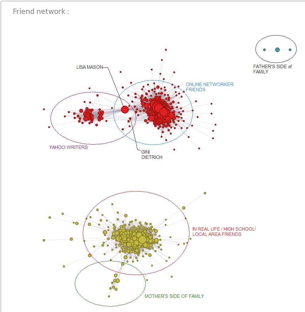
Toward the bottom of the report, Wolfram Alpha displays a spider graph called “Friend Network”. It basically has hundreds of dots, each representing a different friend, connected ro each other through lines of connection. My friend graph displayed two very distinct segments; I immediately recognized this as my online, and offline networks. There were a few lines jumping from one group to the other, but they were very few considering that over 1,400 friends were represented on the graph. There wasn’t a way to tell which group was which however.
It turns out that I had too many friends. Wolfram must have a limit of around 1,000 for full functionality of this feature. It does however let you filter your networks by men or women. When I brought up one or the other, I could hover over specific dots to bring up a tooltip with that users’ profile. All my suspicions were confirmed as I moved from one dot to another. It was one of the most interesting representations I’ve seen n a long time.

This is a depiction of all the females who are friends with me on Facebook. There are two distinct groups, and a few overlapping sub groups. I’ve noted some of the double connections to provide some context to how individual users make up this representation.
It turns out that when it comes to women, none of the women in my online network are connected with women in my offline network. There isn’t a single line going from one side of the gap to the other! There are a couple distinct groups that coalesce within the major separations. Since my friends that write online have mutual connections with the online networking community, they appear as a sub group. One of my friends, Gini Dietrich, used to write for Yahoo! and has some other close ties to active members that still write for Yahoo!. These connections pull her out as a linking profile.
Remember I said that one of the friends I made while writing at Yahoo! was the connection that talked me into networking more freely through my Facebook profile? Well, she is represented by a huge dot in between both online sub-groups, the Vice President of Social Media Sun Lisa Mason. I could tell which dot was hers before I even confirmed it. Her prominent position as the link in an online networking chain, and the overall size of her dot indicate that we share a lot of common connections.
Sub Groups and Visible Relationships
In my offline group of contacts my mother’s side of the family, who do not live in the same area as I do, form their own sub group. A few of my family members on my father’s side that do not share any common connections with either of the groups is displayed in the top right corner of the graph.
Keep in mind that this depiction only accounts for females in my Facebook network. When I look at only males, the fact that a couple offline friends have connected to a couple online friends through me changes the layout of the graph. It turns out that some of my offline network has the same affinity for the game of chess as my online network. Making a single connection across the graph rotates an entire group. The symbolism is undeniable. Think about it! How much meeting one person can affect you. How having a group of people who only know you in one setting eventually see you play a different role. It can turn your whole world on its head, and it can spin your Wolfram Alpha friend graph 90 degrees.
There are ultimatly some analytical insights that you can gain from this application. The application is much more powerful when you use it for the reason it was created however, which is a computational knowledge engine. Take an hour to learn what types of math this program can do, and what types of queries it can handle. You’ll be surprised by its power.
If you’re anything like me though, you’ll be fascinated by how your friend graph lays out. It will bring to mind who the ultimate connectors are in your network, who is really important to you as a social animal, and it will remind you of events that led to a new set of roots growing off in a different direction.
- Blogging Isn’t a Rocket, It’s More Like a Roller Coaster - August 19, 2025
- Value vs. Expectations: The Fight for Startup Survival - July 31, 2025
- The Evolution of Marketing: From Catalogs to Cat Blogs - November 8, 2022
- How to Make a Tweet This Link - February 5, 2022
- Dramatically Improve Marketing Results with Advanced Analytics - September 20, 2021
- The Next Chapter for Social Media Sun - June 4, 2013
- Optimizing Your FAQ to Maximize ROI - December 5, 2012
- Weapons of Influence and Klout’s Role in Marketing - November 17, 2012

Two things:
1.) That graph looks like someone just shot a zombie and it splattered on the wall.
2.) You and Lisa are awesome and I’m glad she’s a big dot on your connections.
No, seriously though this is extremely interesting and I now want to go check it out for my stats! Thanks for the read Adam.
lol it does doesn’t it?
You actually have a similarly placed dot Tim! You’re the dot that connects the same 2 groups on the male graph, but there are 2 other friends in that group that connect, and it’s weird how the interest based relationships that one or two people from Yahoo! have made with my offline network has pulled the entire group to the middle of my online and offline network (they share roughly the same amount of connections to each).
I could spend hours messing around on it if it was connected directly to Facebook and was a little more intuitive, but it’s interesting enough to have wasted a half hour on regardless lol. Everyone’s graphs are going to behave differently! I would love to see what a more average person’s graph looks like, with work, school, family, etc.