 With the transition to the Timeline format, the best Facebook pages aren’t just the ones with the best design anymore. It takes a different type of innovation to thoroughly exploit all of the features the new timeline format offers, but some brands have improved their Facebook presence tremendously.
Here’s a compilation of the best Facebook pages of 2012. It seems everyone’s on Facebook these days (even my mother) but when it comes to fan pages, not all are created equal. Each of these brands are doing something unique with the new format, things that will ultimately increase engagement, customer sentiment and awareness. A tried and true method for developing your own great web applications is by studying what has worked for others, refining it and integrating it with your own ideas. Don’t just copy their applications or design, ask yourself what each aspect of the page contributes to the overall experience, and what is the intent of each design element? You can’t go wrong by taking some inspiration from this list; so without further adieu, here are the 15 best Facebook pages on timeline.
For help making your own Facebook Page With Timeline Great, Check our Facebook Page Tutorial
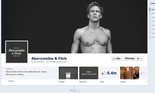
Abercrombie & Fitch
Their marketing approach has always been sleek, simple and bold and on their new Timeline, Abercrombie & Fitch does exactly that. Their cover photo is a simple black and white of a model on a black background, the profile photo is their logo and their tabs also include a video section. They use the Publisher app to communicate regular with fans. Currently they have 6.4 million “likes” and over 45,000 “talking about this”.
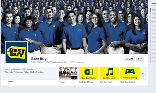
Best Buy
Best Buy’s cover photo features their team in their well-known blue shirts and happy, smiling faces. Bold tabs feature some of their most popular categories- music, movies and gaming. They also offer events and location tabs tailored to your area (once you “like” the page). The Best Buy page encourages users to share their content and it maintains an interactive state. They are running a custom app called “Best Buy” that links products, daily promotions and special deals directly from their website to their fan page.
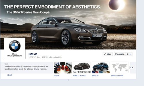
BMW
The automotive industry is known for having an active creative presence. BMW’s fan page has BMW TV, videos, a map to worldwide locations and more. Their Timeline is very fleshed out, going all the way back to when they were founded in 1916. You can literally follow the history and story of BMW from their fan page. This is a very good example of Timeline in action.
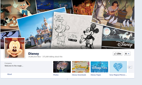
Disney
Disney knows who its target audience is, and it shows on their fan page. Their cover photo is a nice collage of Disney movies, theme parks and original Mickey Mouse sketches. It’s a quick overview of what Disney is all about. Their Timeline, like BMW’s, is also fleshed out to the date they were founded in 1923, complete with original photos and milestones along the way, such as Steamboat Willie’s first appearance in theaters (in 1928). The beautiful photos and stills from Disney movies are another thing that makes this page shine. You can’t help but want to share posts that contain your favorite Disney childhood memories.
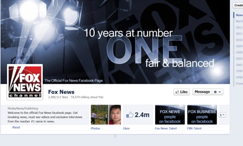
Fox News
Love them or hate them, Fox News is one of the largest news organizations in our country. Fox’s page is clean and simple; their cover photo is eye-catching and reflects what they are all about. One interesting tab is their “Fox News Talent” which shows headshots of their staff with the unique ability to like their personal pages right from this tab. It’s probably a custom app built in-house but it looks fairly simple to set up for yourself.
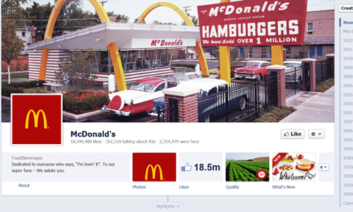
McDonald’s
McDonald’s has a tribute to their original restaurant design in their cover photo and a shout-out to their fans in their info box. With over 18.5 million likes, a fully filled Timeline with the company’s history and beautiful custom tabs describing their new healthier menu options and more, it’s easy to see why this made the list at a top fan page. It promotes the brand appropriately, gives the reader information they need and encourages interaction on a regular basis.
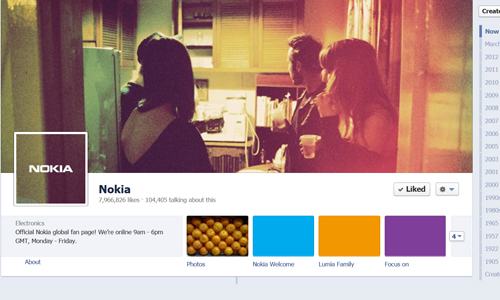
Nokia
Nokia has regular photo contests, demos and other fun stuff to keep their fans interacting with their page. The design is simple, but works perfect for what they aim to achieve. Their Timeline has milestones filled in all the way to 1865 when the company was created. You might be surprised when you learn where and how Nokia got their start. They’re definitely not only about cell phones. I really enjoy the beautiful bold colors on this page and how they make the fans/customers part of the page.
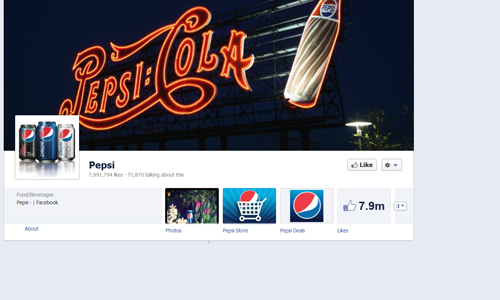
Pepsi
Pepsi knows that people drink their cola so what other ways can they get and keep fans interested? Their fan page is pulling it off with Pepsi Store and Pepsi Deals tabs, bright bold colors, fun quotes and questions and surveys. They maintain a casual, cool and fun tone throughout all of their posts and it just makes you feel like chatting with a friend.
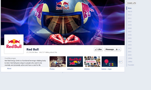
Redbull
Red Bull shows a lot of creativity in all of their advertising and their Fanpage is no exception. The drink is known for “vitalizing body and mind” and it appears that is what their fanpage does as well. Their tabs feature Redbull TV, fun games and apps, and a bold (but characteristic) call to action to like the page (if you haven’t already).
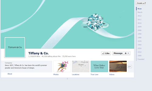
Tiffany & Co.
Even luxury brands like to interact on Facebook. Tiffany & Co. is a great example of successful marketing of a brand via Facebook. They have a simple yet elegant cover photo and beautiful, high resolution images of their products all over their page. Timeline is fleshed out to their founded date and the fanpage exuberates class, just as you would expect from their company.
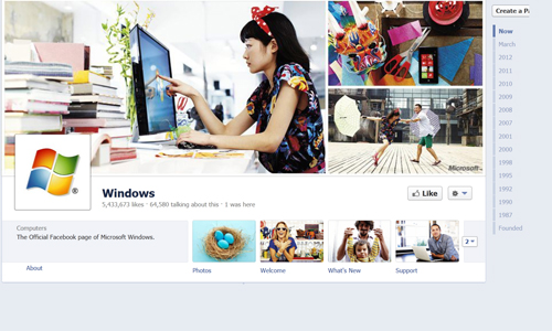
Windows
Windows is reaching out to you, the average consumer, the user, the fan with their cover photo and other page design elements. It’s simple but direct. The Timeline is fully filled out and they are making great use of their tabs, including one for support right in a prominent location.
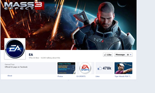
Electronic Arts (EA)
Electronic Arts features their latest game release in their Timeline cover. They could do with some more tabs but their posting/interaction with the fans is impressive. Their content is interesting to the target market and they post regularly. They have loads of shares and comments from the users, which shows that they are doing something right.
Bare Escentuals/ Bare Minerals
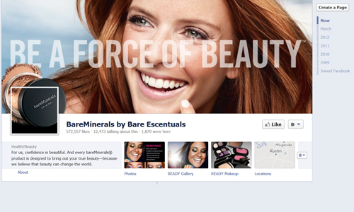
Bare Escentuals makes the most of user content to power their page. The popular cosmetic company is also rocking the tabs with 12 beautiful, brightly colored, useful tabs on their fan page. Contests, articles, beauty tips and beautiful images make this page come to life.
Old Spice
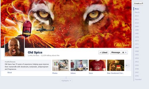
Old Spice has a design, cover photo and profile image that pops- just as you would expect with the company’s new approach to marketing their products. Fun photos and videos, hilarious commercials and the Old Spice store make up the tabs. Their Timeline is filled out completely, marking milestones and their content is likable and shareable. Someone’s using Facebook for iPhone app to post witty, silly and snarky posts to the Timeline such as “Golf is all about technique, and so is alligator wrangling. Tamale eating not so much, but golf and alligator wrangling are for sure.” These get a lot of likes, shares and comments.
Skull Candy
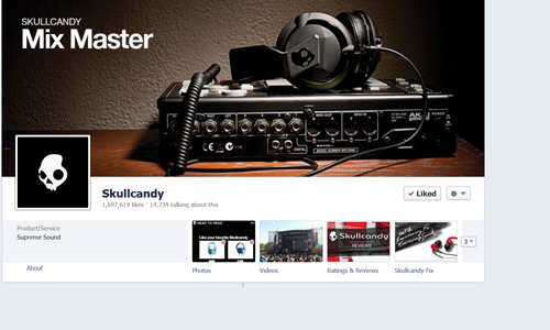
Skull Candy has a beautiful cover photo, excellent use of tabs and shareable content. A younger company than some on the list but their history is fleshed out. Tabs include ratings and reviews, videos and of course, photos of their products. They run a “Fan of the Week” promo that shows that they care about the fans and they take time to interact with them and reward them.
- WordPress vs. Blogger: Which is Best? - February 4, 2025
- Instagram for Business - January 4, 2024
- Privacy Settings in Social Media - June 20, 2021
- Seven Premium Social Media Tracking and Analytics Tools - January 26, 2021
- Social Media College Degrees and Courses - July 3, 2019
- Get the Most Out of Your Content By Optimizing for Success - May 29, 2019
- Impact of Social Media on Society: 5 Times Social Changed the World - February 17, 2019
- The Power of Social Media for Bloggers - September 17, 2013

Nice Pages
Thanks for reading Charles
Good choices. Thanks for your time for analysis. Waiting for more.
Thanks! We hope you keep reading. We have so many great things planned here for Social Media Sun.
Hello Lisa,
Great list of some coolest fb pages. I will like all the pages. Thanks for sharing cool info.
Thank you, I appreciate you.
Yes, these are some smart points you make Lisa. Some great examples of business pages where the companies are actually trying to make their social media properties the place where people go when they want to discuss their brand.
I think having 4 tabs is a design point though, and optimal if you can have 4 really important applications. More isn’t always better, but I guess it depends on your audience. If your fans are likely to browse on the page and explore other areas of content, 10 tabs offers more choices, and more opportunities that one of them will be something that fan likes.
In the case of EA, I think you’re right about them needing more tabs. A good example of using a few tabs for a dramatic increase in connection is FOX News’ Talent Tabs. After a fan has liked 5-10 FOX broadcasters, they’re 5-10 times more likely to be exposed to a FOX update.
Thanks Lisa! These are great examples of clean, elegant looking pages. I’m a firm believer in the use of images in attracting and engaging users. The new timeline offers a fantastic template for this.
This is great! Thanks for sharing!