It’s excruciating and we both know it.
How on earth can the most visited page on your site bring in so little?
I’m talking about your homepage.
Typically, for the majority of websites, the homepage receives more than 50% of all visitor traffic. And yet most businesses have very little to show for it.
No better leads. No rapid list growth. No hike in appointment requests.
Just a couple of sign-ups and the odd e-mail.
That’s it. Ugh.
Maybe you’d have been better off not getting those hoards of visitors to begin with. All the massive traffic goes poof into the digital abyss just like that leaving you with a pretty traffic graph in your analytics tool but nothing much to show for it.
Worse, these measly results come after investing a fortune in PPC advertising, Facebook Ads, site design, promotion tools, outsourced pillar content, and more.
Today, things are about to change.
I’ve come up with 5 simple tweaks you can make on your homepage and reap powerful conversion benefits almost instantly. Before we get into the details, why should you prioritize homepage optimization in the first place?
3 Reasons Why You Need To Optimize Your Homepage Today
#1. The homepage is the most visited page on your site.
As said earlier the homepage receives most hits.
Surely every effort must be made to convert that massive traffic into revenue.
#2. The homepage is your brands first impression.
Mess up on the first impression and you might never get a second chance.
#3. The homepage marks the beginning of your funnel
Although it is true that in a sense almost every page on your site is a landing page, your homepage is the best and easiest place to start your funnel.
The key to optimizing the homepage and maximizing gains is easy.
Shun complexity and embrace simplicity.
Most brands tend to have complicated homepages brimming with shiny tech toys but no conversions to match the flamboyance. The answer lies in keeping things bare and basic.
Let’s get started.
#1. Simplify Offer
When someone lands on your site you have 5 seconds or less to make them stay.
Not only that.
In those few seconds, you have to differentiate yourself from your myriad competitors. No easy feat. Most sites just echo their competitors. How can prospects choose you above the competition when you’re the same?
Sam Ovens does an excellent job with his offer.
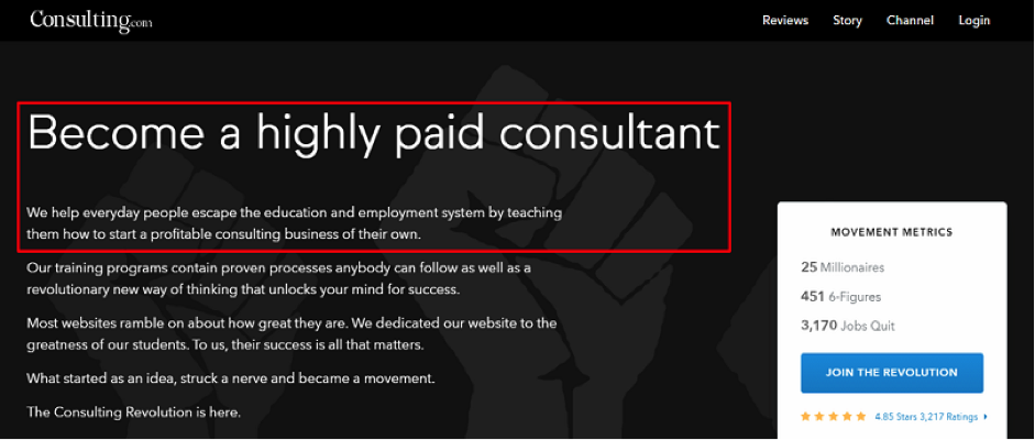
In just five words “Become a highly paid consultant” he captures the essence of his offering. He helps regular folks make money through a starting and growing a consulting business of their own.
Here’s how to do it
- Boil down your offer to a single statement.
- Focus on the biggest benefit you provide for your audience.
- Use simple everyday language not dry hard-to-get corporate speak.
- Concentrate on clarity not cleverness.
- Differentiate yourself from your competitors by highlighting what you do best simply and clearly.
A case study done by Web Profits showed that a simpler offer improved conversions by 52.8%.
Make your USP and value proposition ridiculously obvious so prospects pick why you are different in an instant.
#2. Simplify Headline
Here’s the burning question readers have when they land on your site?
Who are you and why the hell should I care?
If you analyze the question, you’ll realize it’s not really about you. It’s all about THEM. Sadly, many sites go on and on about how great they are.
Big mistake.
Write for your target audience and forget everyone else. Make your homepage headline so clear that visitors know in a flash who you are and what you are about as Jacob McMillen does.
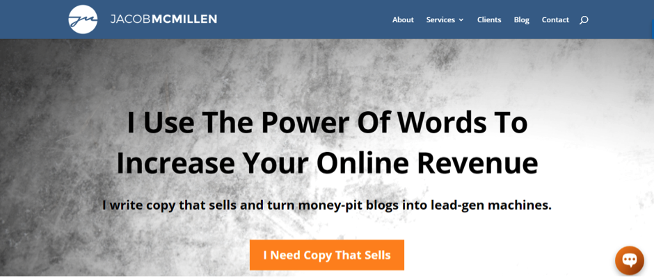
The headline and subhead make it clear that Jacob is a copywriter who generates leads and makes money for his clients.
Here’s how to do it
- Write your headline for your ideal prospect and forget everyone else.
- Zero in on a unique and huge benefit highly desired by your audience.
- Your headline should answer the 3Ws: who are you, what do you do, who do you do it for?
- Make your headline short, sharp, and sweet: 12 words or less.
- Don’t just write one headline, craft many. Keep writing, testing, and tweaking until you find a winner.
- And, of course massage your keywords into the headline.
Long-winded copy kills your headline. Keep it short, specific, and benefit-oriented.
#3. Simplify Social Proof
Before your prospects do business with you, they want to know if you are qualified to solve their problems.
This is huge because if they deem you unqualified, they’ll bounce off.
You’ve got to demonstrate your authority fast. See what Aaron Orendorff does on his homepage.
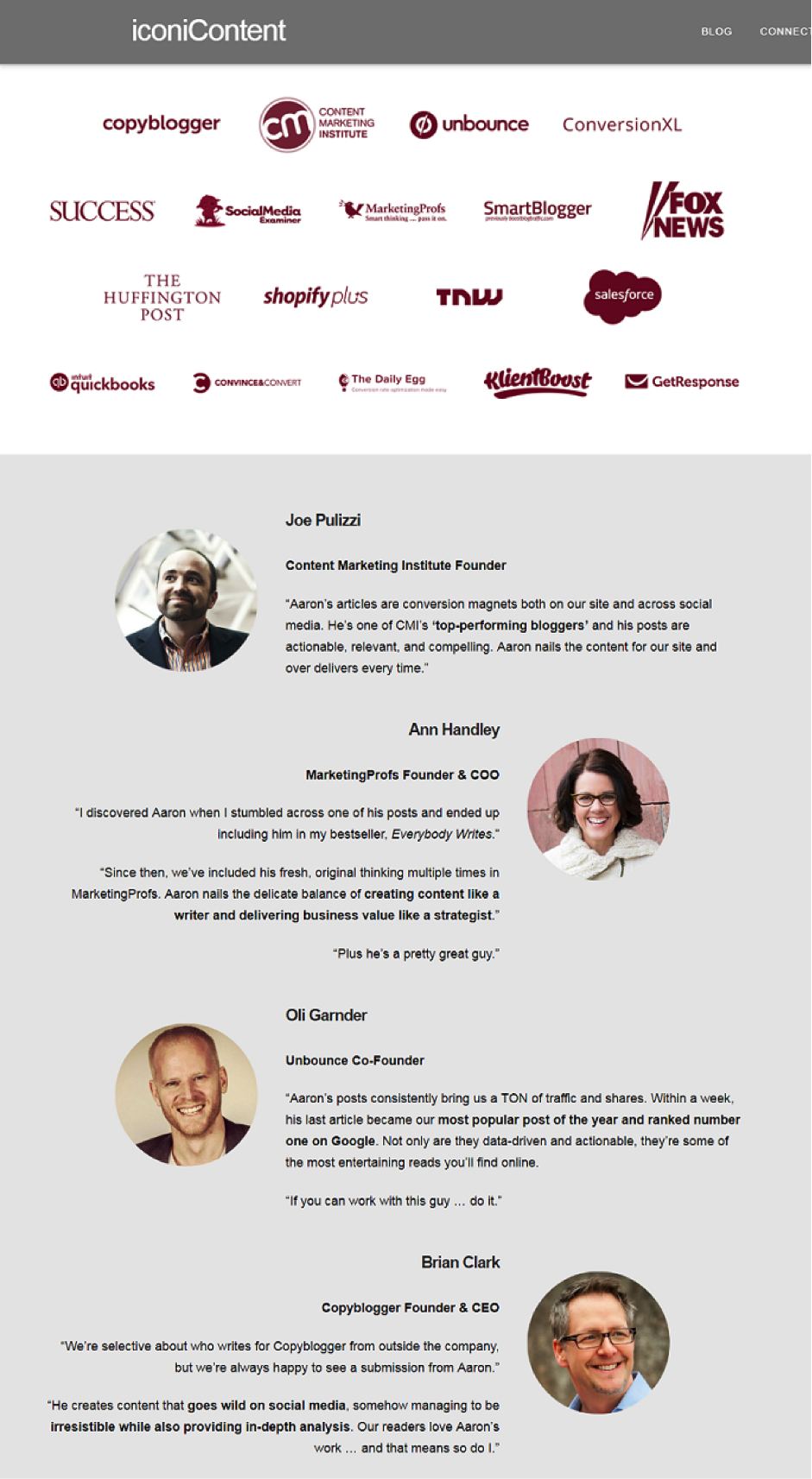
Aaron underlines his authority in two ways. First, he plasters his page with logos of widely popular niche blogs he’s been featured on. Secondly, he captures endorsements he’s received from influencers in his niche.
On seeing all this, his readers can tell he’s the real deal.
Here’s how to do it
- Showcase huge blogs or publications you’ve been featured on.
- Display testimonials of thrilled customers raving about you and what you do.
- Show testimonials of authority figures in your niche for 10x the impact.
- Point to well-known brands in your space that you’ve worked with.
- Exhibit any industry awards you’ve won.
- Present the massive number of clients you’ve served or followers you have.
- Include ratings and reviews especially if many people have graded your product/service. Econsultancy reported that product reviews are 12x more trusted than product descriptions and sales copy from manufacturers.
According to Optin Monster, social proof can boost conversions by up to 70% and there are so many ways of incorporating it into your copy.
Boost your clout score by displaying authority-pointers simply and powerfully.
#4. Simplify Design
Yes, content is king but don’t forget the king lives in a lovely palace.
So your site’s got to look good.
How your site looks hooks or repels visitors. If you botch site design, your visitors’ first impression of your brand may be their last. Of course, design is not only about looks but usability as well.
Convert Kit’s homepage is simple but elegant.
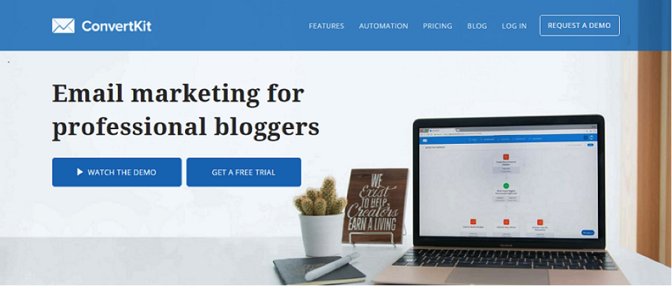
See how spacious the design is? Everything has ample room to breathe: navigation, headline, CTAs, and graphic. Not only is this visually appealing, it makes it easy for users to see and select what they want. It has a few prominent menu items.
Here’s how to do it
- Don’t skimp on design. Hire a good designer and she’ll do the rest.
- Buy a ready-made theme that’s close to how you want your site to look.
- Limit your menu to 7 or less since the short term memory can only store 7 items at a time.
- Keep your navigation simple and uncluttered.
- Make visitor journeys short. Let people get to what they want in two clicks.
- Don’t crowd your page with too many graphics, CTA’s, links, and options.
According to Neil Patel, websites with simple designs have higher conversion rates.
#5. Simplify Copy
For some reason, when companies write business copy, they insist on sounding ‘business like’, whatever that means.
The result?
High bounce rates as people flee the barrage of gobbledegook and corporate speak squeak.
According to a Havard Business Review article, the “single biggest driver” of a consumer’s likelihood to “follow through on an intended purchase, buy the product repeatedly, and recommend it to others” was “by far … simplicity.”
In other words simplicity has a dollar value.
For your business sake, write like a human to humans. Your page will convert better. Zendesk nailed their homepage. The copy is simple clear, and compact.
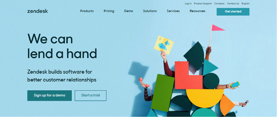
From “can we lend a hand’ on top” to “this could be the beginning of a beautiful relationship” at the bottom the copy is smooth and easy to read.
Here’s how to do it
- Identify and eliminate all gobbleydegook from your copy.
- Edit your writing so it sounds like speaking not writing.
- Use a simple laid-back conversational style that grabs attention.
- Break-down hard-to-swallow big words into smaller ones that go down easily.
- Simplify complex ideas by using relevant examples.
- Eliminate verbosity: use as many words as it takes to make your point and no more.
- Shortcut: hire a great writer. She does all the above.
Simpler copy makes visitors read more and convert better.
Follow The Da Vinci Way
Leonardo Da Vinci was right: simplicity is the ultimate sophistication.
With the plethora of tools, tricks, and toys available today the temptation to go over the top on your homepage is great.
Don’t.
Not only is overkill a waste of precious resources, it also decimates conversions.
Simplicity’s the way to go.
Make your homepage simpler, clearer, crisper.
You’ll be surprised how much more it’ll boost your ROI from the same amount of traffic. That’d be great wouldn’t it?
- 3 Proven Ways To Gain Credibility As An Internet Marketer - May 1, 2025
- 3 Easy Ways To Grow Your Business (With Examples) - January 5, 2025
- All-in-one Marketing Tools: The New Normal In Digital Marketing - August 27, 2022
- How To Close More Sales On Social Media - December 9, 2021
- 3 Small Business Affiliate Marketing Mistakes Costing Your Brand - August 9, 2021
- How To Run A Video Ad Campaign On Facebook - October 7, 2019
- Twitter Purge: What It Is And Why Your Business Should Care - October 19, 2018
- 3 Smart Ways Retailers Can Boost Twitter Engagement - July 5, 2018
Amazing hacks. Really enjoyed it.
http://www.digitalpacemaker.in/SearchEngineOptimization
Glad to hear the post resonated.